My Foray into Graphic Design
When I first named this project “Badux”, the name suited its purpose. Now that I am earnestly trying to grow a stable audience, I am unsatisfied with both the name, and the look and feel of my site. I’ve been a lot more concerned about usability lately, and I’ve made a lot of improvements in that regard. But I need to change the name. There is no obvious one way to pronounce “badux”. Even worse, it spells out “bad UX”. In my circles anyway, “UX” stands for “user experience”, and a bad user experience is to be proactively avoided.
A friend of mine and I brainstormed some ideas for names, and he used AI to build out a little logo for each one. I’ve been looking for ways to get feedback on the names, and any design ideas we had. So I created a survey, which was basically a series of A-B choices, matching the different candidate names against each other. Initially, I had the choices between the logos. But then, in discussions with another friend, I realized that what was most important was to settle on the name, at least at first, and allow for any design elements to come later. So the survey I actually released was mostly just a series of A-B choices between the unadorned names.
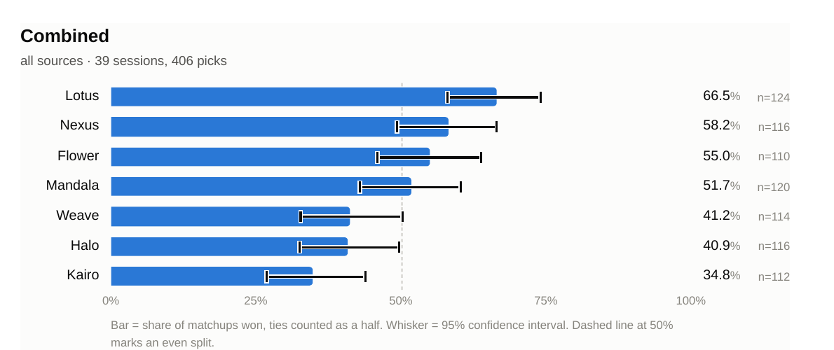
I posted the survey wherever I could get away with it for free, and got a decent enough response. I wrote up the results in a PDF that you can look at here if you are interested. It was enough to call a top-three list, but I was going to have to provide some sort of incentive to the survey - I was looking into a sweepstakes for the survey participants - to get enough responses to nail it down to a single one. And I figured, I am going to have to get feedback on the designs as well, so why not couple each of the top three names with a design, and bring that forward?
I used Claude Design to do just that. First, I got it to produce a design reference document for the site as it existed. Well, not exactly, because I spotted some pre-existing design problems in the process, so the design document incorporates fixes for those as well. (And so does the site.) Then I proceeded to make matching design documents for the top three names.
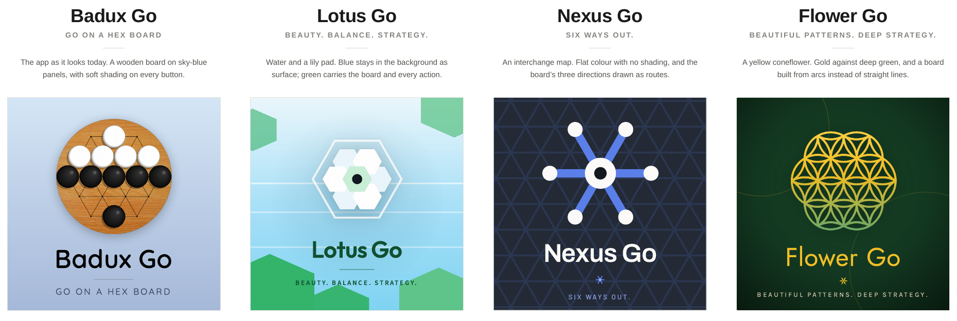
I already had some design ideas for Lotus and Flower, so I started with those. I let Claude come up with the initial design for Nexus, and it was pretty good. After a lot of fixes and touchups, it looks as good to me as the other two. Then I arranged the visual material in the design documents into a side-by-side comparison of the four versions. The next step is to put the design comparison in front of a small group, get some feedback on each of the designs, and find out which ones they like the best.
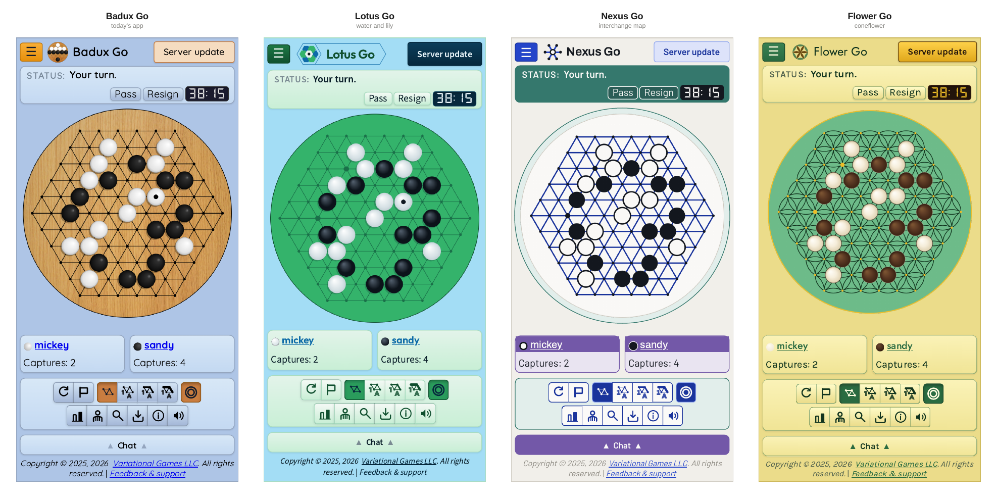
I’ve drawn a lot in the past, and painted, and paid attention to UX concerns, but this is my first foray into graphic design itself. It was pretty fun, and I’m really proud of my results. Here they are:
What adjustments would you make? Which one is your favorite? Let me know what you think!